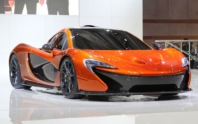
Designers on Design Franz von Holzhausen on the McLaren P1 I ran into Tesla Model S design chief Franz von Holzhausen at the Paris Motor Show as we were both on the way to the unveiling of the McLaren P1 supercar. After graduating from Art Center College of Design with a bachelor’s degree in Transportation Design, Von Holzhausen began his career with Volkswagen under J Mays and worked on such seminal projects as the Concept One (which became the new Beetle). He then moved to GM, and drew critical acclaim for his Pontiac Solstice/Saturn Sky roadster. In 2005, Mazda hired von Holzhausen as its North American design chief. Under his watch, the company developed the Nagare design language, revised the style of the RX-8 and Mazda5, and launched the 2009 Mazda6 and Mazda3.
Designers on Design Franz von Holzhausen on the McLaren P1
 |
| Designers on Design Franz von Holzhausen on the McLaren P1 |
Designers on Design Franz von Holzhausen on the McLaren P1
 |
| Designers on Design Franz von Holzhausen on the McLaren P1 |
Designers on Design Franz von Holzhausen on the McLaren P1
Mazda Furai front three quarter 300x187 imageOne of my favorite concept cars of all time was executed by Franz and his team; the rotary-powered, LMP1-based Mazda Furai. Why do I still love it so? Because unlike most concept cars, it wasn’t just a pretty face, but a full runner that I got to experience around Mazda Raceway Laguna Seca.
Franz obviously knows something about fast cars and great designs, so just after McLaren boss Ron Dennis and Managing Director Antony Sheriff raised the sheet on McLaren’s all-new P1 supercar, I asked him for his first impressions:
FvH: Makes the 12C kind of old and tired. It’s got a great stance, it sits well, reminds of the F1 [McLaren’s first street legal sports car]. Yeah, I like it. It’s definitely got a menacing feel to it – a pissed-off face. It has a BIG greenhouse and I’m wondering about that proportion – but it’s hard to tell from here.
I love the sculpture on the body side. Reminds of stuff that we were doing in the past. Apparently it’s very functional as well, with the intakes going right from the door into the engine. So I can appreciate that, the form and the function kinda working together. It’s awesome.
Yeah, but it makes the 12C dated for sure.
McLaren P1 profile.jpeg 300x187 image
MT: Have you ever worked with [McLaren head of design] Frank Stephenson before?
FvH: No, I haven’t. I was looking for him on the stage, but I just know of him from, you know, the designer crowd, and but I think he did a pretty solid job. In general I think the car is cool. Way better than in pictures, sits way better on its wheels, from here. I’ll have to come back later, tomorrow, when there is less people to get a better view. But you know it’s awesome, Ron Dennis is up there — you don’t see that every day. Seeing Ron in person is very cool.
And I appreciate them continuing to just go for it.
MT: What do you think about the orange color?
FvH: I’m wondering about it. There must something about it I’m just not aware of. Is it the brand color…? I love the simplicity of the stand with the orange and white, it’s super cool. But is it the right color for the car?
MT: Well, everyone knows you designer types only like light gray or silver for your concepts so you can show off the lines…
McLaren P1 rear view 300x187 imageFvH: [Laughs] Actually, orange is one of my more favorite colors, but this shade seems a bit, um, overly mature. I think a car like this, if you could get some screaming colors on it, it would be all that more impressive.
I do see a lot of reference from the F1 in the side feature. Hard to tell about the silhouette but from what I’ve seen, the silhouette is pretty similar.
MT: I noticed that the McLaren logo seems to be used as a throughout the car – in the headlights, hood scoops, etc. You know, the upside-down swoosh, punctuation mark…too much repetition? What do you think?
FvH: Oh as an element on the car – front, rear, everywhere – the “boomerang.” It reminds me of the Kumho tire logo. But you know it’s subtle enough that you know it’s not too overt.
It doesn’t punch you in the face…and you know the car does look fantastic.


